EPM Design System
Overview
Over nine years working on Infor EPM, I built and evolved the product's design system through four major generations, with a fifth currently underway.
What started as a visual consistency initiative eventually became a design-to-code ecosystem supporting thousands of screens, dozens of product modules, multiple themes, and a React component library shared across the entire product.
I was responsible for defining component specifications, maintaining the Figma library, collaborating with front-end developers, supporting adoption across the product team, and helping shape long-term design system strategy.
Building the First Foundation
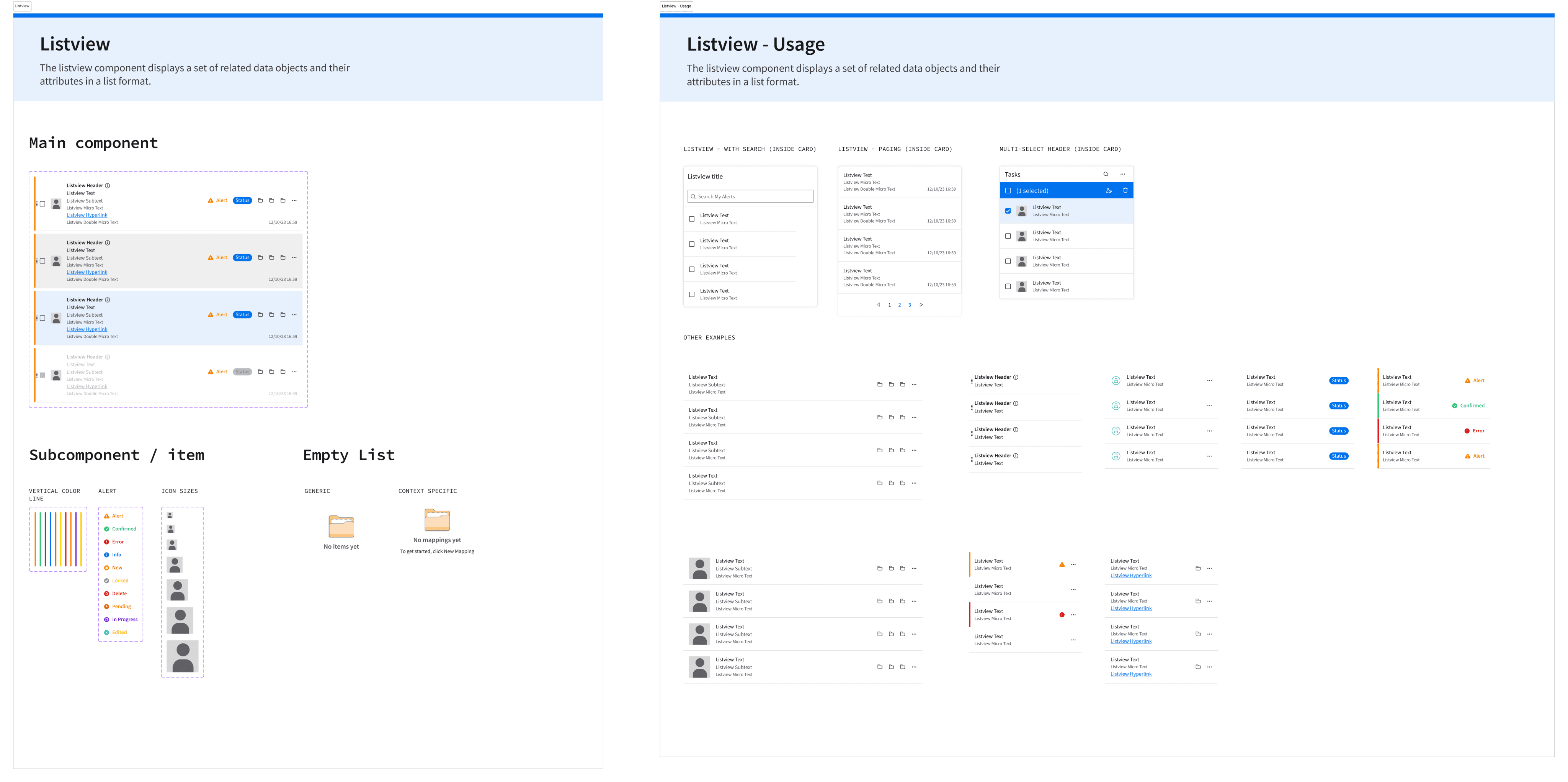
When I joined the team, the product had no centralized design system.
Years of product growth had resulted in inconsistent patterns, styles, spacing, colors, and interaction behaviors spread across thousands of screens.
My first challenge was conducting a large-scale audit of the product and identifying common patterns that could be standardized into reusable components.
The process took nearly a year. Every major screen and workflow had to be analyzed, compared, and consolidated into a shared visual language.
The goal was not simply creating components, but creating consistency across an entire enterprise platform.
From Design System to Design-to-Code
One of the most important lessons I learned was that design systems become significantly more valuable when connected directly to code.
After defining the initial component set, I worked closely with front-end developers to translate the design system into reusable React components.
The workflow typically looked like this:
- Identify a design problem or recurring pattern.
- Validate whether some existing component could already solve it.
- Create specifications covering behavior, accessibility, theming, and use cases.
- Review implementation with developers.
- Validate implementation and iterate when edge cases appeared.
Once implemented, React became the source of truth.
While Figma components can be modified accidentally or diverge over time, implemented components remain stable and governed through development processes, making them a much more reliable foundation for long-term consistency.
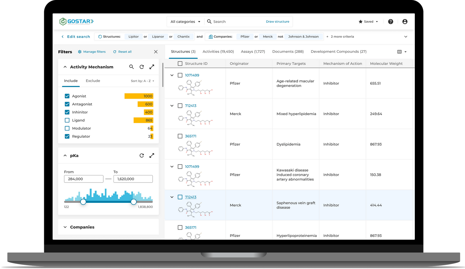
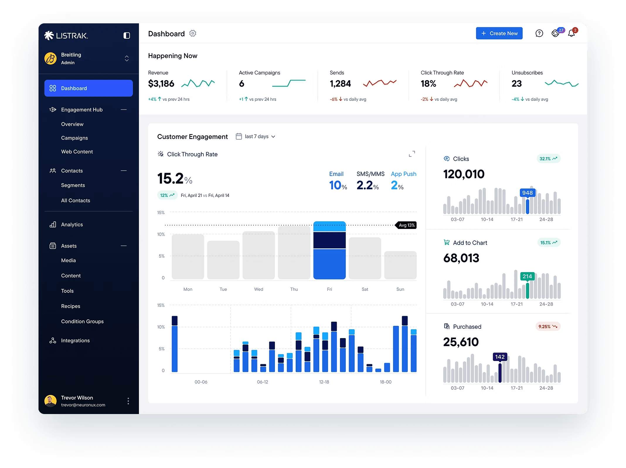
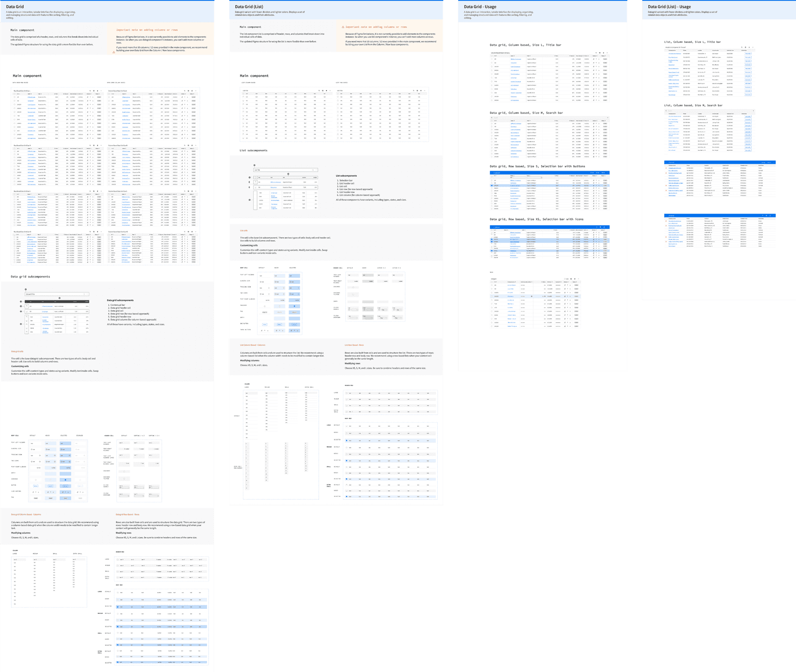
Scaling Across Thousands of Screens
As the product continued to grow, the design system became an increasingly important part of everyday work.
Instead of repeatedly solving visual problems, designers could focus more on workflows, usability, and business requirements.
The design process gradually shifted from creating interfaces from scratch to assembling solutions from proven building blocks.
The library also improved:
- consistency
- accessibility
- development efficiency
- onboarding
- design quality
For many workflows, building interfaces became closer to assembling Lego blocks than designing every screen from the ground up.
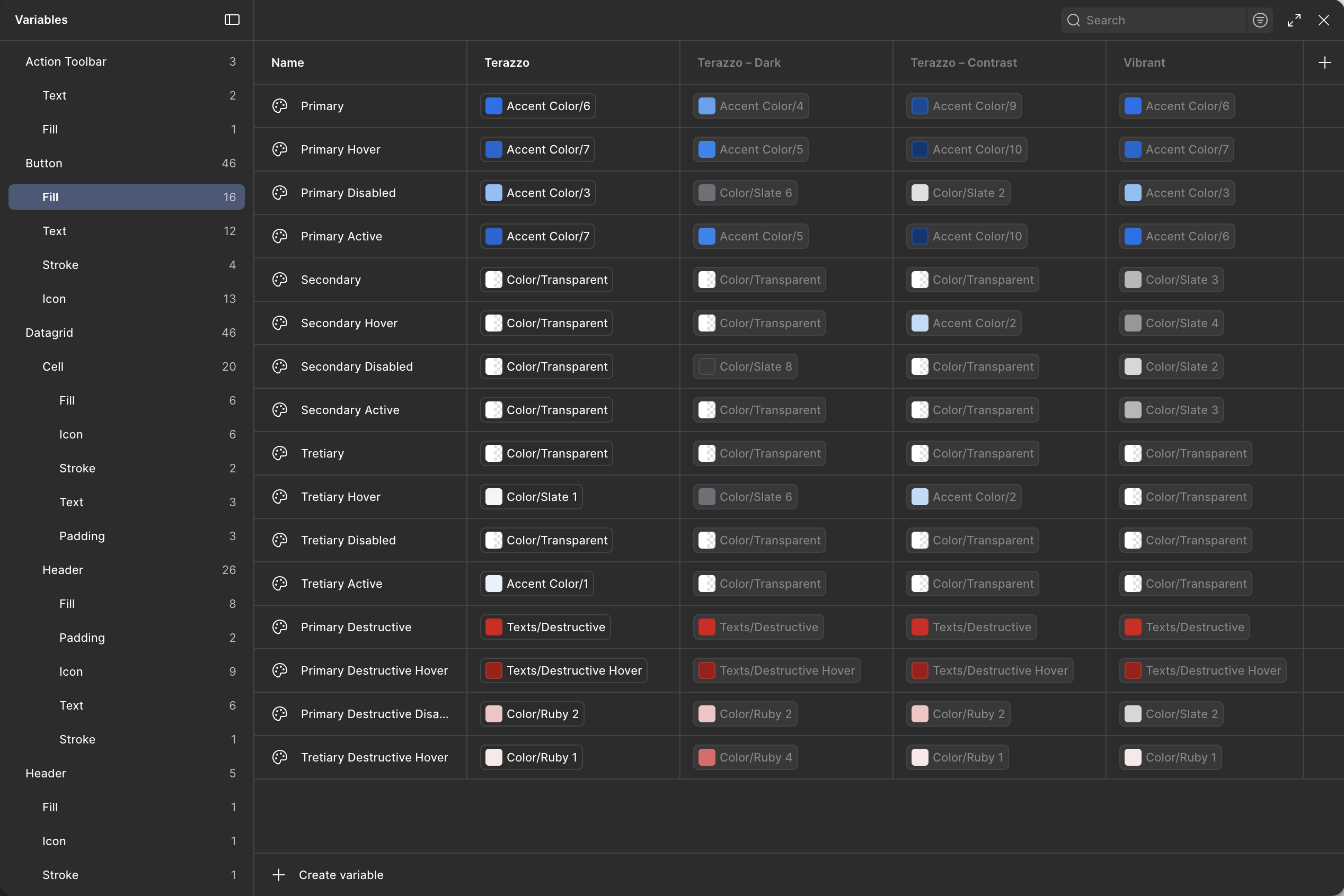
Supporting Themes & Accessibility
As accessibility requirements and customer needs evolved, the design system expanded to support multiple themes.
In addition to the default experience, I created Dark and Contrast themes using variables and tokens.
This required every component to support theming consistently while maintaining visual quality and accessibility standards.
The introduction of variables significantly changed how the library was structured and became one of the major reasons for rebuilding the system rather than continuing to patch older components.
Four Generations of Evolution
The design system evolved through four major generations.
Generation 1
Built from scratch in Sketch to standardize a large existing product.
Generation 2
Migration from Sketch to Figma as the platform matured and became the primary design tool.
Generation 3
Refactoring around Figma variants, nested components, and improved component architecture.
Generation 4
Complete redesign using variables and tokens to support theming and long-term scalability.
Rather than chasing a "perfect" design system, each generation responded to changes in product requirements, team workflows, and design tooling.
One of the biggest lessons was understanding that design systems are never finished. They continuously evolve alongside the product.
Collaboration & Governance
The system was maintained through close collaboration between designers and developers.
New components were introduced only after reviewing whether existing solutions could solve the problem first.
Naming conventions, usage patterns, accessibility considerations, implementation complexity, and future scalability were all discussed before components entered the library.
This governance process helped reduce duplication while keeping the system flexible enough to support product growth.
The design system also became influential outside of the immediate team. The global Infor design organization regularly consulted me while developing their own component library, and many ideas, patterns, and improvements were shared between the two systems.
Looking Ahead: AI & Design Systems
As AI-assisted prototyping becomes more common, the relationship between design systems and code becomes even more important.
Today, I am working on the next generation of the library with a stronger focus on AI-assisted workflows, React integration, semantic naming, and component documentation.
The goal is not only helping designers create interfaces faster, but helping AI tools generate more accurate prototypes using existing production-ready components.
In this model, clear documentation, predictable structure, and strong design-to-code alignment become just as important as visual consistency.
Impact
Over nearly a decade, the design system became the foundation of a large enterprise product consisting of thousands of screens and dozens of modules.
It enabled greater consistency, improved accessibility, reduced duplication, accelerated design and development workflows, and helped designers focus more on solving user problems rather than rebuilding common UI patterns.
More importantly, it created a shared language between design and engineering that continued evolving alongside the product, the team, and the technology stack.